With a dSLR, you start with a massive image, lots of detail, and a resolution high enough that real artwork can be done down to the size of a pixel. Wrinkles vanish, hairlines are filled in, blemishes fade away, and pounds can melt into a trim waistline. While possible with what a digicam offers, the artwork is much more difficult and often impossible to fully hide.
Instead of such detailed artwork, we’re going to look at a couple of things that can be quickly and easily done with a digicam’s output. Since I no longer live near a beach, I’m going to have to borrow this image I found on the internet of Trinidad. A quick google search of “beach” landed me this beautiful shot. While I don’t know for certain what camera was used, the compressed jpeg image is the equivalent of a digicam’s shot.

The tool I’ll use is paint.net (found here), I have a little bit of patience, and what I’d like to see for my final product is a beach with those swimmers out in the water. The young lady on the cell phone is not important to me, so she has to go. Since I can not pluck her out of the image and expect to see the beach that is in front of her, we have to use a bit of digital magic. With a two dimensional image like this, it’s important to remember that, as far as we’re concerned here, there IS no beach directly in front of her. The sand stops at her hip, and starts again on the other side of her hand. Erasing her is worthless, because we’d be left with a vacant area. How, then, would we remove her from the image? To be technically accurate, we cannot. However, we can cover her up.
Sand is wonderful for this, because the very nature of its randomness suits it to be picked up and moved around from one place to another without being obvious. We see the chaotic texture and just accept it without paying too much attention to duplicated ripples. However, the human eye is designed to see patterns, so if you are not careful, it will suddenly become very obvious that something has been done to your image. Water, too, has enough randomness that you can copy its texture across a field and keep it believable.
The key is to make it believable. Not perfect. Ideally, you simply want your viewer to not pay attention to that area, thinking there is nothing important there. If you make it too obvious that artwork has been done, then it will become such a distraction that it may have been better to have left well enough alone. If you are able to mask your work well enough, the illusion will be sufficient for your viewer to simply accept what you are showing them as a straightforward image, revealing only the story you want to tell.
To cover this woman up, I’m going to use the most basic tool available. I’m going to select a square of sand, copy it, then paste it over her. Then I’ll select more sand from a different area, and past that over an edge. I continued doing this, attempting to capture textures (like the streaks of wet sand) that will flow from one block to another and create the illusion of continuity. I’ll take a bit of water, include the sliver of a wave, and do the same for the portion of the woman that is protruding out into the ocean. I’m taking big lumps of pixels and covering her up, just like you would with paint.

And this is the result. The woman is gone, hidden behind big squares of sand and water. Except it is very obvious that there are big squares of sand and water, now. It’s probably worse than when we started, because instead of my viewers simply dismissing the woman as a distracting but unimportant part of the image, they are now focused on that spot and wondering what is wrong with the image. Or their eyes.
While I could go back in and, taking much smaller squares of sand and try to break up the obvious lines, that would be far too much work. Also, any viewer looking close enough would still see the regularity of lines and differences in shade and the effect would be the same.
Let’s start over with a different tool. This one does the same thing that I had been doing, picking up pixels and copying them into another area, but it uses a softer approach more likely to blend and fade into the surrounding textures. This is the tool I’d use in Photoshop as well, but paint.NET is free! While not quite as particular or adjustable as the Photoshop tool, this one will do perfectly fine for our digicam-based masterpiece. This tool is called the Clone Stamp.
I’m going to open the original image up again, and I’m going to select the Clone Stamp tool. Bumping my brush size up to a whopping 8, I’ll then ‘anchor’ the tool over beside her in the sand. Hold the control key and click some sand beside her leg to ‘stamp’ the tool, or anchor it, and then release the control key and begin painting over her legs to ‘paste’ the pixels. You’ll see the small circle of your anchor moving in relation to where you are painting, showing you what pixels you are picking up and copying. Just like painting, you’ll have to pick up more ‘paint’ every once in a while to make sure you’re not making your work too obvious. You’ll have to select a new patch of sand and copy it across, making sure to carry the textures over as believably as possible. A lot of control-click, then paint a few pixels, and then select more pixels, and paint with them.
The portion of her that protrudes into the water (mostly her head) requires even closer detail. You’ll have to zoom in rather close in order to make sure your lines match. You want to make sure to especially capture that section where sand meets water and continue that line from one side of her head to the other.
At this point you may be noticing that the colors are very different from one side of her to the other. The left is a bit brighter than the right. Trying to bring them together makes the difference even more obvious. While paint.NET does not have a ‘smudge’ or ‘blend’ tool as other programs might, it still allows you to use these effects up in the ‘effects’ toolbar. Select a small area where the colors are very different, but the texture is the same. For instance, the area in the water between the two waves. The water is the same blue (if lighter/darker), but the waves are an obvious white that you want to remain crisp. When you have the proper area selected, choose a blur effect. I used the ‘motion blur’ effect in order to sweep the light and dark water together. Zoomed in this close, it looks messy, but when you zoom out, the effect is minimal enough that the viewer’s eye will likely be fooled into thinking the water fades from light to dark in an even way.

This picture is a result of these steps. Looking at that area, you can still see the places I cloned, and possibly a few places where I blurred two areas together. To get a better effect will require more time, especially zoomed in very closely to see the details you want to make less obvious.
This image was taken with the digicam I previously used for the comparison of pink roses. This is an older image, taken during a summer that allowed for more vibrant roses. You can see that the digicam has no trouble focusing on the big, vibrant blooms, and leaving the house and fence to blur into the background. However, it does not give the narrow depth of field that we saw from the D60. To mimic that effect, we’ll use one of the tools we used for the beach image above. We are going to blur some of the pixels to make them look more out of focus. There are two ways to do this.
One way is to select the roses in the foreground (don’t forget the leaves that are at the same distance), copy them into a new layer, and then blur the entire image behind them. Select the roses using the Magic Wand tool (set at 40% tolerance) and use the ctrl-key to select additional patches of pixels. Use your Undo option if you accidentally select more than the subject you want to keep in focus. The other way, the one I chose, is to select the roses (again using the Magic Wand tool), and then reverse our selection (Edit-Reverse Selection) and copy everything except the roses into a new layer. Putting that layer on top of the roses, I deselected it, and used Gaussian Blur set to 10. This allows a little bit of overlap for the blurred pixels to cover the edges of the roses. Doing it the other way would cause a rather sharp edge that makes it look like the roses were cut outs from a different image and out of place in this scene.
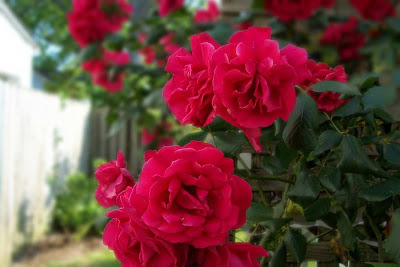
This is the result. It isn’t exactly what a dSLR would give you, but it is closer. Just like with the beach image, more effort and more time spent perfecting the edges and making sure the selections were exact would allow for an even more effective illusion of a narrow focus. Nevertheless, 10 minutes and knowing what you are aiming for, and you have the soft, dreamy look with a specific subject that is still crisp but now stands out more from its background.
Somehow, crisp roses look a lot better than they sound.
No comments:
Post a Comment